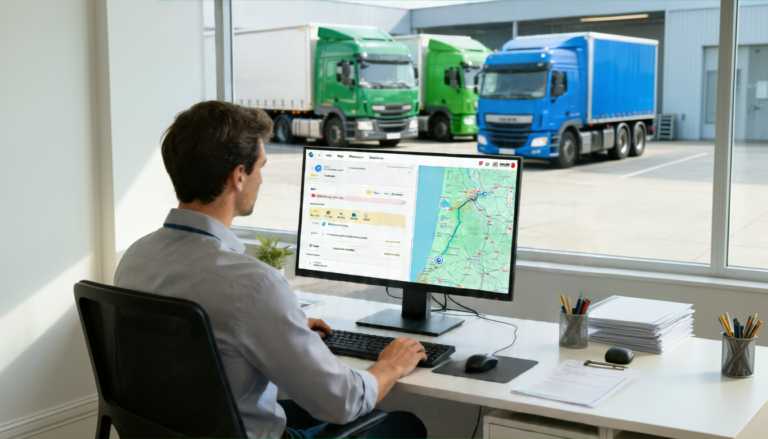
Recently we have incorporated in our platform FlotasNet a panel that allows to visualize quality information in a fast and simple way for the decision making in the companies. This panel is the “panel of indicators” that allows you to have at a glance, an idea of the fleet and drivers´ behavior and their productivity.
The data that the default dashboard shows us, is the data collected during a whole year until the current date of our fleet selection. It is important to emphasize that we will have more and more precise data in the vehicles that have contracted the highest levels with connection to the telemetry of the vehicle.
Within the control panel, there are three options: balanced scorecard, traffic productivity and driver management. Each of these panels is designed for a different profile. The operation of the three panels is similar, there appear several indicators with data of the whole year separated by months, if we click on any of these columns, the month will be split into weeks, and if we click on a week it will be split into days.
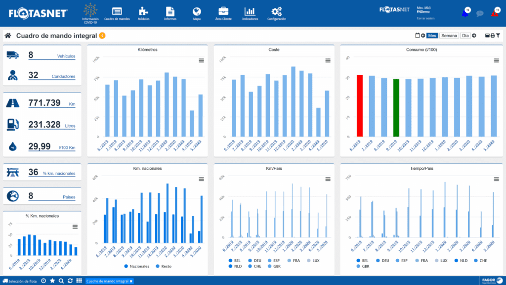
In the balanced scorecard, the objective is to provide information in a clear and agile way that allows an analysis of the productivity of the services. The summary column is shown with the number of vehicles and drivers whose data is represented, the sum of kilometers traveled, the number of liters consumed, the average consumption, the percentage of kilometers traveled in national territory and the number of countries visited. In addition, seven additional graphs show the percentage and number of kilometers traveled on national territory, the breakdown by country, time by country, kilometers traveled to consumption and approximate cost of operations.
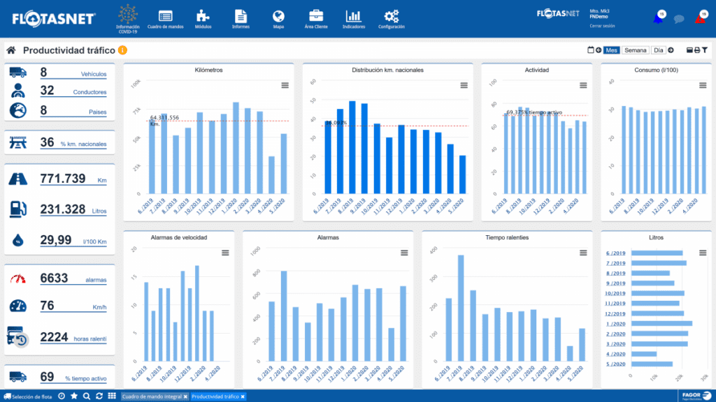
The second of the panels is focused on knowing at a glance how the traffic department works. A first summary column is shown with the number of vehicles and drivers whose data is represented, the number of countries visited, the sum of kilometres travelled, the number of litres consumed and the average consumption. In addition, the shows the number of wings, average speed, time spent by vehicles idling and percentage of time active. In addition, 8 additional graphs show the kilometres travelled, the distribution of these on national territory, the percentage of activity, consumption, number of speed alarms, number of alarms, idle time and litres consumed.
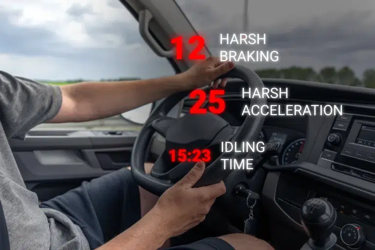
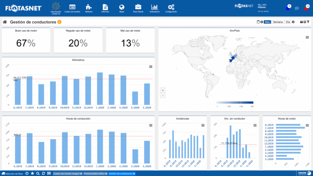
The third panel is oriented to driver management. Regardless of the organization of a company, human factors management is essential, especially since wages are mainly calculated by the productivity, but can be penalized for infractions and bad behavior. First line displays a summary with a percentage of each driving style and six additional graphs that show the number of kilometers driven, driving hours, number of incidents, kilometers driven without driver identification, engine hours and kilometers driven in each country.
If you want to know all the information about this panel of indicators, its uses and functionalities, in the following video we show you.